15 influential art and design movements you should know
By Nick Carson published April 10, 2019
Brush on up your knowledge of these major periods in art and design history.
As a designer, inspiration can come from anywhere. But sometimes influences, attitudes and approaches converge to form a coherent movement that has a knock-on effect around the world.
There have been hundreds of art and design movements of different sizes and significance over the centuries – some centred on the style or approach of a particular collective of artists in a particular place, others spanning many creative disciplines, and much more organic in terms of interpretation.
Whether they happened 150 years ago or 30 years ago, the impact of many of these is still felt today – you may even have felt their influence without knowing it. These things often move in cycles, particularly with the contemporary trend for retro aesthetics. So a little knowledge of art history goes a long way.
ART AND DESIGN MOVEMENTS: QUICK LINKS
01. Impressionism
02. Arts and Crafts
03. Art Nouveau
04. Cubism
05. Futurism
06. Constructivism
07. Bauhaus
08. Art Deco
09. Surrealism
10. Abstract Expressionism
11. Swiss Design/ ITS
12. Pop Art
13. Minimalism
14. Postmodernism
15. Memphis
Art techniques: top tutorials for painting and drawing
There are certain art and design movements that creatives need to be familiar with. Read on for our comprehensive guide to 15 of the most influential art and design movements of the 20th century.
We've put these in chronological order, with the examples on page 2 and page 3 most relevant to graphic designers, and those on this page and page 2 likely to inspire more artists and illustrators. Use the quick links menu to jump straight to the section you'd like to explore first, or scroll on to read them in order.
01. Impressionism and Post-Impressionism - Ấn Tượng và Hậu Ấn Tượng
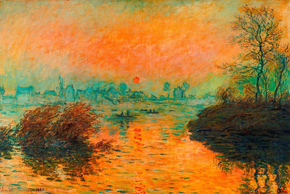
Phát triển ở Pháp vào cuối TK19, Chủ nghĩa ấn tượng là trường phái mỹ thuật bắt nguồn từ 1 nhóm nhỏ hoã sĩ muốn thoát khỏi các chủ đề truyền thống như lịch sử, thần thoại mà hướng tới việc nắm bắt chính xác hình ảnh thực tế của ánh sáng, màu sắc, chất liệu.
Developing primarily in France during the late 19th century, Impressionism was a fine art movement in which a small group of painters eschewed the then-traditional emphasis on historical or mythological subject matter in favour of depicting visual reality, and particularly the transient nature of light, colour and texture.
Seven painters were at the core of this hugely influential movement: Claude Monet, Pierre Auguste Renoir, Camille Pissarro, Alfred Sisley, Berthe Morisot, Armand Guillaumin and Frédéric Bazille – and worked and exhibited together.
The Impressionists abandoned the established palette of muted greens, browns and greys for their landscapes in favour of a much brighter, expressive range of colours in an attempt to depict conditions such as dappled sunlight, and reflections on rippled water.
Instead of greys and blacks for shadows, they used a whole range of complementary colours – and objects were depicted using dabs of paint rather than defined with a hard outline.
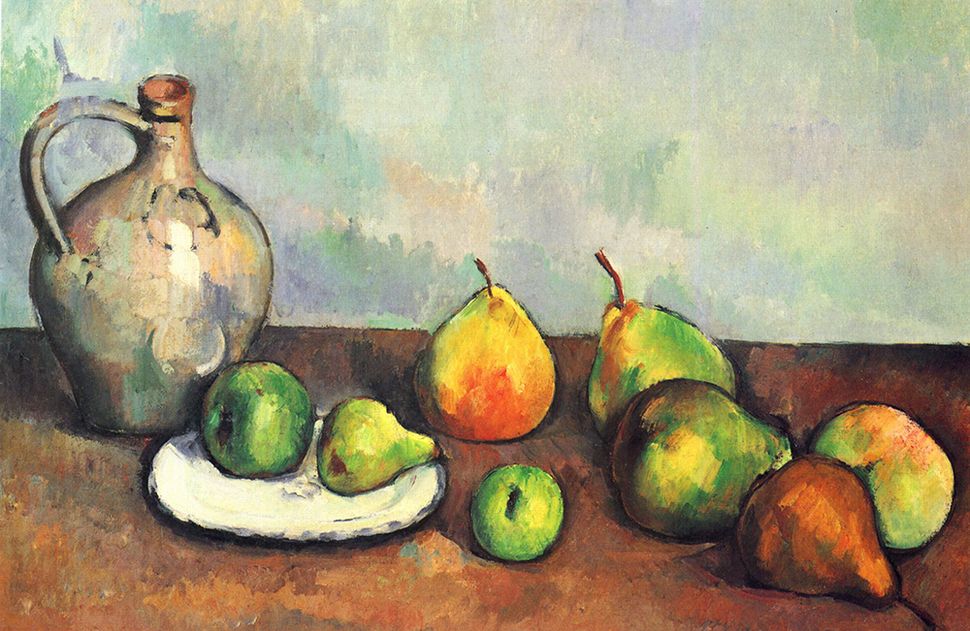
Post-Impressionism embraced many of the tenets of its predecessor movement, whilst also rejecting some of its limitations. Painters such as Paul Cézanne, Georges Seurat, Paul Gauguin, Vincent van Gogh and Henri de Toulouse-Lautrec used similarly pure, brilliant colour palettes and expressive, short brush strokes, but also sought to elevate the work to something less transient and experimental.
Rather than ever-changing conditions of natural light and its effect on colour, Cezanne and the other Post-Impressionists focussed more on solid, permanent objects, with still-life paintings – such as Cezanne's Pitcher and Fruit, and van Gogh's Sunflowers – emblematic of the movement.
Paint like an Impressionist
02. Arts and Crafts -
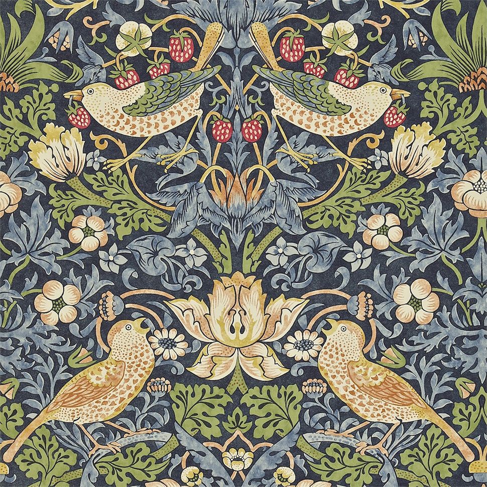
As a reaction to the rise of mass production (and corresponding decline of artisan craftsmanship) during the Industrial Revolution, there was a resurgence of interest in decorative arts across Europe in the second half of the 19th century – fittingly known as the Arts and Crafts movement.
At the vanguard of this new movement was reformer, poet and designer William Morris, who formed a collective of collaborators in the 1860s to try to reawaken the handcrafted quality of the medieval period. They produced beautiful metalwork, jewellery, wallpaper, textiles and books.
By 1875, this collective became known as Morris and Company, and by the 1880s the attitude and techniques they practiced had inspired a whole new generation of designers, and the Arts and Crafts movement was born.
While many criticised the practicality of such intricate handicrafts in the modern, industrialised world, the influence of the movement endures to this day.
03. Art Nouveau - Nghệ Thuật Mới
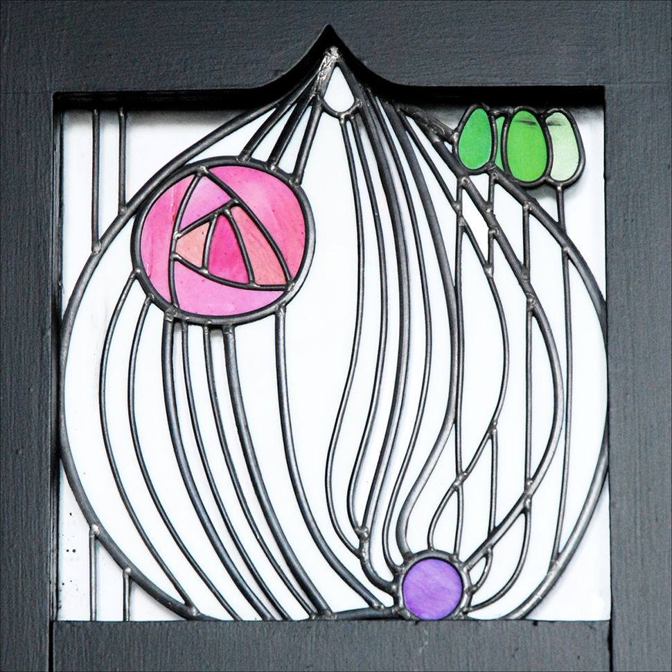
Following on from the Arts and Crafts movement, Art Nouveau was a primarily ornamental movement in both Europe and the USA. One distinctive characteristic of the style is the use of organic, asymmetrical line work instead of solid, uniform shapes – applied across architecture, interiors and jewellery, as well as posters and illustration.
Intricate ironwork, stained glass, ceramics and ornamental brickwork were used expressively, with freeform lines taking precedence over any pictorial elements in the designs, which were often inspired by delicate forms found in nature, such as flower stems, vines, creepers, tendrils and insect wings.
Scottish architect and designer Charles Rennie Mackintosh was a leading exponent of the Art Nouveau movement, as well as Czech graphic artist Alphonse Mucha, and iconic Spanish architect and sculptor Antonio Gaudí – whose magnum opus, Barcelona's La Sagrada Família, has famously been under construction for more than 130 years.
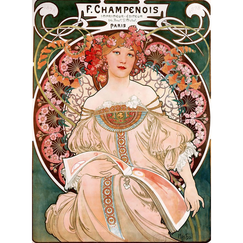
Mucha's stunning artworks, many of which were commercial commissions for advertising clients, combined the flowing organic lines and natural motifs of the Art Nouveau style with sensual portraits of women.
While the decorative style fell out of fashion after 1910, it saw a resurgence in the 1960s thanks to a series of major exhibitions in London, Paris and New York, which retrospectively helped elevate a style once seen as a passing fad to the status of an international movement that influenced fashion, music design and advertising.
04. Cubism - trường phái Lập thể
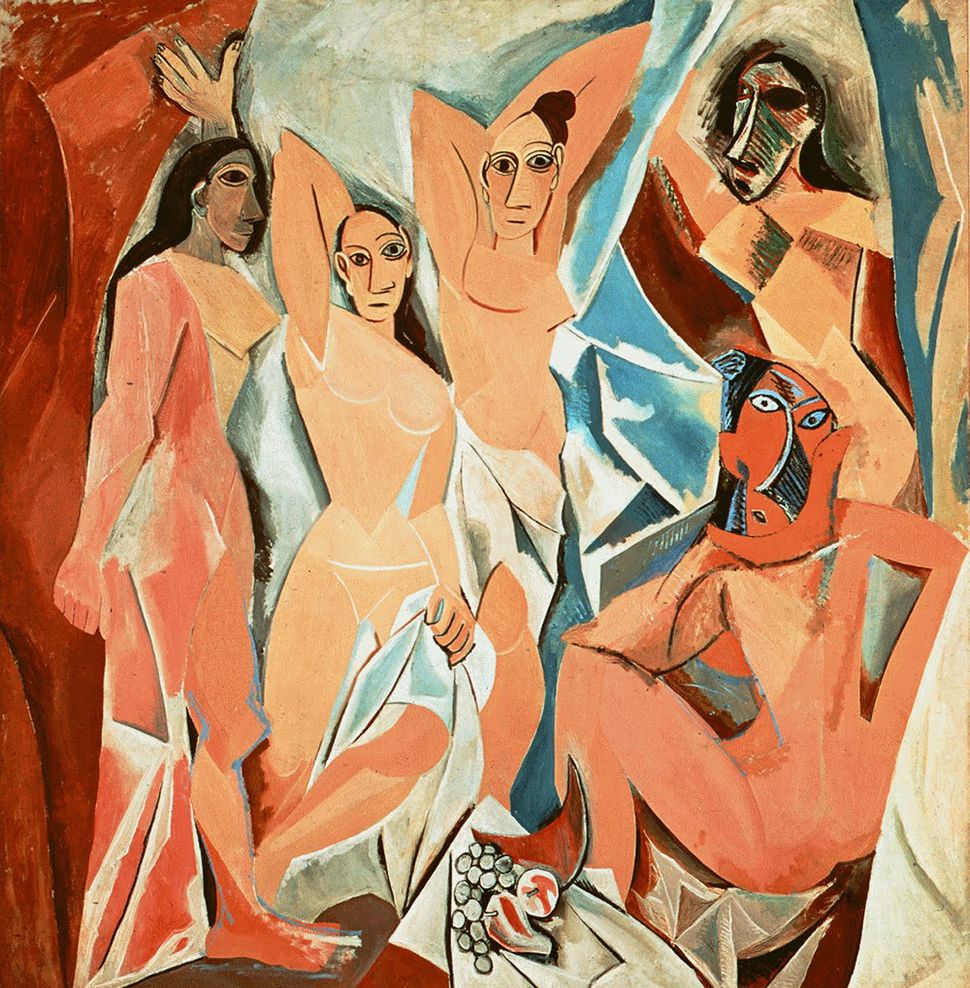
Two artists were instrumental in founding the Cubist movement: Pablo Picasso and Georges Braque. Unlike the expressive attempts to capture natural conditions in Impressionism and Post-Impressionism, Cubism was about flat, two-dimensional, distorted objects – sacrificing accurate perspective in favour of surreal fragmentation.
The name came from a disparaging remark by art critic Louis Vauxcelles, who described Braque’s 1908 work Houses at L’Estaque as being "composed of cubes". But it was Picasso's Les Demoiselles d’Avignon, painted the previous year, that set the wheels in motion, depicting five female nudes as fractured, angular shapes.
As Braque and Picasso continued to explore how abstract shapes could be used to define familiar objects, the period from 1910-1912 is often referred to as Analytical Cubism. A distinctive palette of tan, brown, grey, cream, green and blue prevailed, and common subjects included musical instruments, bottles, newspapers, and the human body.
Post-1912 this evolved into Synthetic Cubism, where multiple forms are combined within the increasingly colourful artworks, which made use of collage techniques to explore texture. The visual language defined by Braque and Picasso was later embraced by many other painters, and also influenced sculptors and architects such as Le Corbusier.
05. Futurism - Trường phái Vị Lai
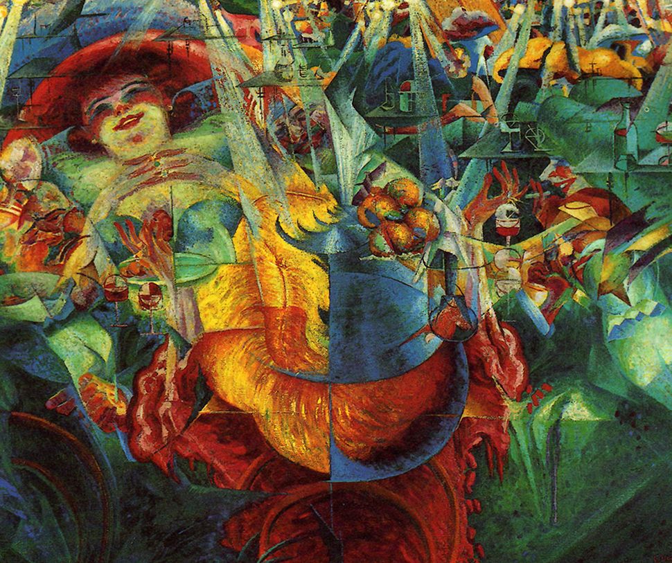
Founded in Italy in the early 20th century, Futurism attempted to capture the pace, vitality and restlessness of modern life through highly expressive artwork that ultimately glorified war, Fascism and the machine age. The aesthetic style would later spread across Europe, and notably into Russia.
The movement was officially announced in 1909 when Parisian newspaper Le Figaro published a manifesto by Italian poet Filippo Tommaso Marinetti, who coined the term to describe how his work celebrated social progress and cultural innovation.
Cutting-edge technology such as the automobile was put on a pedestal, while traditional values – and historical institutions such as museums and libraries – were aggressively repudiated.
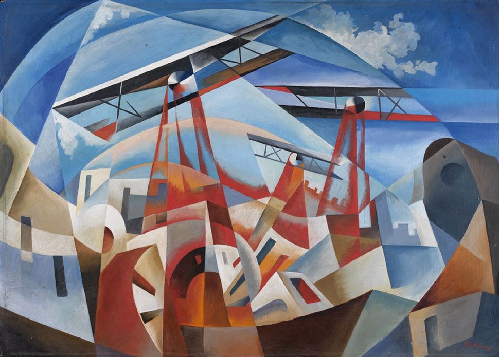
Two of the leading proponents of Futurism, Umberto Boccioni and Antonio Sant'Elia, were killed in combat in 1916. However, the aesthetic would go on to be expressed in modern architecture, as visions of mechanised cities defined by towering skyscrapers became a reality, while artists such as Tullio Crali kept the style going into the 1930s.
(part 2)
06. Constructivism - Trường phái Kiến Tạo
Portrait of Lilya Brik for the Soviet publisher Gosizdat (1924) by Alexander Rodchenko
Alexander Rodchenko's distinctive style of graphic design graced many Russian propaganda posters
Strongly influenced by both Cubism and Futurism, Constructivism was an artistic and architectural movement initiated by Soviet painter and architect Vladimir Tatlin, who co-authored the so-called 'Realist Manifesto' in 1920 with sculptors Antoine Pevsner and Naum Gabo.
Similar to Futurism, Constructivism glorifies technological and industrial progress, with a radical aesthetic that places function over form. As the name implies, the aesthetic is literally about 'constructing' art from a kit of component parts, like a machine. Its distinctive style was widely used for Soviet propaganda posters.
Beat the Whites with the Red Wedge (1919) by El Lissitzky
Beat the Whites with the Red Wedge (1919) is a propaganda poster by El Lissitzky, depicting the Red Bolsheviks defeating the White movement in the Russian Civil War
Leading figures in Constructivism included graphic designer, photographer and sculptor Alexander Rodchenko and artist, designer and architect El Lissitzky. While Tatlin and Rodchenko remained in the Soviet Union, Gabo and Pevsner helped spread the Constructivist aesthetic to Germany, France and later England and the US.
Meanwhile, Lissitzky influenced the artists and architects of the Berlin-based de Stijl movement, as well as Hungarian painter and photographer László Moholy-Nagy, a professor at the Bauhaus.
07. Bauhaus
Bauhaus poster by Herbert Bayer
The simple shapes and primary colours of the 'Bauhaus style' is neatly summed up by this Herbert Bayer poster
Founded by the architect Walter Gropius, the hugely influential Bauhaus school of design, architecture, and applied arts ran in Germany from 1919-1933, when it was shut down by the Nazi regime.
The school sought to bridge the gap between art and technical craft – not unlike the goal of the Arts and Crafts movement, although the Bauhaus favoured modern mass-production over individual artisan methods.
Students took a six-month preliminary course, where tutors including Johannes Itten, Lyonel Feininger, Josef Albers, Herbert Bayer and László Moholy-Nagy gave them a rigorous education in both the craft and theory of everything from carpentry and metalwork to textiles, graphics and typography.
While the resulting works were hugely diverse, the prevailing style associated with the Bauhaus is that of simple, elegant geometric shapes, combined with bold primary colours – an aesthetic that spread across graphic design, products and architecture long after the school was closed down.
08. Art Deco
Art Deco London Underground posters 'Shop between 10 and 4' and 'Play between 6 and 12' by Edward McKnight Kauffer
These striking London Underground posters by graphic artist Edward McKnight Kauffer embody many features of the Art Deco aesthetic
A major international movement across western Europe and the US, Art Deco takes many of its cues from Art Nouveau, as well as elements of Bauhaus and Cubism. It originated in Paris, where the 1925 Exposition Internationale des Arts Décoratifs et Industriels Modernes gave it its name.
Style, elegance and sophistication are the order of the day in an Art Deco design, communicated through simple, streamlined shapes; stylised, often geometric ornamentation and elaborate use of expensive materials, both natural and synthetic.
Spanning architecture, furniture, fashion, sculpture and more, Art Deco encapsulates the decadent spirit of the 1930s – and the Rockefeller Centre, Chrysler Building and Empire State Building were all designed in the style.
Advertisement
Although Art Deco fell out of fashion somewhat during World War II, it saw a resurgence from the late 1960s onwards, and continues to inspire decorative arts, fashion and jewellery to this day.
09. Surrealism
The Persistence of Memory (1931) by Salvador Dali
Salvador Dalí's seminal work The Persistence of Memory (1931) is a Surrealist masterpiece
Like Art Deco, Surrealism flourished in the interim period between the World Wars. It grew out of the 'anti art' Dada movement in the early 20th century, but in place of Dada's often nonsensical, satirical vibe – a negative reaction to the horror and futility of war – it brought a much more positive creative expression.
In his 1924 Surrealist Manifesto, poet and critic André Breton argued that Surrealism was about reuniting conscious and unconscious experience; bridging the gap between a fantastical dream world and rational reality.
Leading Surrealist painters included Jean Arp, Max Ernst, André Masson, René Magritte, Yves Tanguy, Salvador Dalí, Pierre Roy, Paul Delvaux and Joan Miró – all of whom had a uniquely personal twist on the movement, and how art could express the sometimes bizarre, sometimes deeply unsettling depths of the unconscious mind.
Unlike the relatively rigid visual language of contemporary Cubist art, Surrealist art was much more organic and freeform, putting the emphasis on symbolism and content rather than form.
10. Abstract Expressionism
Jackson Pollock Abstract Expressionist artwork
American artist Jackson Pollock was one of the central figures of the Abstract Expressionism movement
Advertisement
Beginning in the 1940s, the Abstract Expressionism movement fuelled the development of modern art as we know it during the following decade. New York was the hub, and prominent artists such as Jackson Pollock, Willem de Kooning, Franz Kline and Mark Rothko led the way.
Often filling huge canvases with dynamic, powerful applications of paint that evoke everything from violence to sensuality and everything in between, Abstract Expressionist artists drew influence from various avant-garde artists who had arrived in the US in the late 1930s and early 1940s, fleeing Nazi-occupied Europe.
White Cloud Over Purple (1957) by Mark Rothko
In contrast to Pollock's chaotic, energetic style, Mark Rothko's works – such as White Cloud Over Purple (1957) – are calmer and more structured, but no less expressive
Unlike its predecessors Expressionism and Post-Expressionism, Abstract Expressionism didn't attempt to depict the observable world with any degree of realism, but rather convey an emotional response. While the free, spontaneous, totally abstract nature of the work is a common factor, however, the movement incorporated a broad range of styles and techniques.
Advertisement
Known as action painting, one variation – demonstrated by Jackson Pollock – is particularly loose and dynamic, defined by aggressive, sweeping brushstrokes or partly random splashes and drips of viscous paint. At the other end of the scale, painters such as Mark Rothko worked with much thinner mixtures of paint to create large, soft-edged rectangles of flat colour.
(part 3)
11. The International Typographic Style
Josef Müller-Brockmann's Modernist posters
These beautifully simple, graphic posters by Josef Müller-Brockmann embody the essence of Modernism
Although Modernism in its broadest sense encapsulates many of the avant-garde movements on this list that broke the boundaries of traditional artistic expression, the peak of Modernist art and literature occurred in the years between the First and Second World Wars.
Following World War II (1945), graphic designers in Switzerland and Germany developed a cohesive, unified Modernist movement that became known as Swiss Design, or the International Typographic Style. Building on the rational approach of the Bauhaus, this movement – still embraced by many graphic designers – is all about functionality and universality.
Logical, modular grid systems provided a structured framework to align different elements, something now considered essential for most forms of graphic design. The unbiased, graphic accuracy of photography was preferred over more expressive illustration, alongside neutral sans-serif typefaces such as Helvetica.
One leading figure was Josef Müller-Brockmann, whose designs for posters, publications and advertisements helped define the Swiss Design aesthetic – particularly through his long series of Zürich concert posters, which combined geometric forms, bold colours and clean, sans-serif type.
As the 20th century progressed, many multinational corporations adopted the clean uniformity of the International Typographic Style to create brand guidelines for trademarks, colours and typefaces, and help ensure consistent application across all media.
12. Pop Art
Marilyn Monroe (1967) by Andy Warhol
One of the much-loved symbols of the Pop Art movement: Andy Warhol's iconic prints of Marilyn Monroe
Primarily a British and American cultural phenomenon that gained traction in the late 1950s and 1960s, Pop Art was so named by art critic Lawrence Alloway because of the way it glorified popular culture and elevated commonplace, often unremarkable objects to iconic status – such as soup cans, road signs and hamburgers.
Sources of inspiration ranged from television to comic books to advertising, rejecting the pretensions of 'high art' as well as the expressive, subjective nature of Abstract Expressionism in favour of bold, graphic printmaking.
Although many contemporary art critics derided Pop Art as vulgar and sensationalist, its inclusive, accessible and democratic nature was praised by others – and it also drew a certain amount of influence from the 1920s Dada movement that ridiculed European high art in the wake of the First World War.
Whaam! (1963) by Roy Lichtenstein
Making use of the colour dots and flat tones of commercial printing, Roy Lichtenstein's stylised depictions of comic strips were another Pop Art staple
Roy Lichtenstein's print reproductions of comic book scenes were a particularly striking example of the Pop Art aesthetic, as were Andy Warhol’s repeated silk-screen prints of everything from soap cartons to celebrities.
These American artists' work was stark and graphic, compared to their British Pop Art counterparts such as David Hockney and Peter Blake, who took a more subjective, almost romanticised view of pop culture from across the pond.
13. Minimalism
Harran II (1967) by Frank Stella
Now belonging to the Guggenheim Foundation, Frank Stella’s Harran II (1967) is a mesmerising visual interplay of line, shape and colour
Characterised by extreme simplicity of form and a very literal, objective approach, Minimalism originated in New York in the late 1960s, driven by dissatisfaction with the spontaneous, messy subjectivity of Action Painting in Abstract Expressionism.
For the Minimalists, this style was too insubstantial and personal – they believed art should be clean and self-contained, without external references. Hard edges, simple forms and clean lines dominated in primarily two-dimensional graphic artworks.
Abstract Expressionism still had its share of influence on the movement, but primarily the calmer, more organised colour-field works of painters such as Mark Rothko, Barnett Newman and Ad Reinhardt.
Méditerranée (1952) by Ellsworth Kelly
Ellsworth Kelly’s first wholly abstract relief, Méditerranée (1952) is based around a grid of nine coloured squares
Advertisement
Ultimately, Minimalism was about exploring the essential elements of an art form, stripping away extraneous detail and emotional expression in favour of objective, purely visual elements that were open to interpretation.
In its broadest sense, Minimalism has enjoyed a significant resurgence in fields such as branding, UI design and packaging – due in no small part to influential global companies such as Apple and Google prioritising a clean, pared-back aesthetic above ornament and decoration.
14. Postmodernism
WET magazine cover (1979) by April Greiman and Jayme Odgers
This cover for WET magazine (1979) by April Greiman and Jayme Odgers sums up the Postmodernism aesthetic
Modernism celebrated social progress, and the idealistic pursuit of utopia. Whether religious or scientific, it was about how universal principles could make sense of the world, and Modernist artists put more emphasis on form, technique and process than on the subjects of their work.
Mid-century modernism: 15 iconic examples
Advertisement
Postmodernism was a reaction against this attitude. In place of idealism and reason was scepticism, suspicion and a denial of the existence of universal truths that can describe the world around us. Postmodernist artists advocated complex individual experience and interpretation over the simple clarity of abstract principles, and the resulting aesthetic was multi-layered and often contradictory.
By the late 1970s, many designers working in the Modernist tradition felt it had lost its innovative spirit, and that it had become stale and academic. Questioning the rigid 'form follows function' philosophy of the International Typographic Style, they were inspired to rip up the rule book and break grids, challenge expectations and introduce decorative, subversive, and at times eccentric design elements.
April Greiman was a particularly acclaimed Postmodernist designer, often collaborating with photographer Jayme Odgers on colourful montages and innovative typographical experiments. Their WET magazine cover, for instance, collages colour photocopies with textured papers and airbrushed colour.
Michael Graves poster (1983) by William Longhauser
William Longhauser put a Postmodernist twist on architect Michael Graves' name in this 1983 poster
Another leading exponent of the style was William Longhauser, who worked with dynamic, geometric patterns to create stylised typographic arrangements. In one particular poster from 1983, he built the last name of Postmodernist architect Michael Graves out of geometric forms that allude to the shapes, patterns and textures found in Graves' buildings.
Advertisement
Since the late 1990s, Postmodernism has fallen out of fashion to some extent, although a subversive 'anti design' aesthetic does enjoy popularity in some areas, such as music and indie publishing. However, despite various attempts to define the period since – including post-postmodernism, trans-postmodernism, post-millennialism, pseudo-modernism and metamodernism – none have gained mainstream traction.
15. Memphis
Memphis design furniture
A section of furniture and objects designed by the Memphis Group collective in the 1980s
Drawing on many of the tenets of Postmodernism, the Memphis design aesthetic challenged the neutral, understated, functional Modernism that preceded it. With its roots in furniture design, the Memphis Group collective was founded by Italian designer Ettore Sottsass in the 1980s, and existed for just six years.
Colourful, garish furniture was at the heart of the movement, but the aesthetic went on to influence fashion, graphic design and more. Simple geometric shapes; flat colours combined in bold, contrasting palettes; stylised graphic patterns with black-and-white stripes and abstract squiggles – these are the ingredients of Memphis-inspired design, influenced by earlier movements such as Pop Art and Art Deco.
Many of the movements on this list enjoyed considerable longevity in their heyday, and influenced millions of creatives across many different disciplines. Many led to new movements, either complementary or contradictory, as new attitudes and approaches took hold.
Advertisement
Memphis is one of the most niche examples of all: a handful of Italian designers who created a series of bizarre, kitsch products 30 years ago are influencing a whole new generation of designers today.
Nguồn: https://www.creativebloq.com/inspiration/15-influential-art-and-design-movements-you-should-know
