5 Elements of Layout Design
These are the standard design elements that any designer will use when developing a layout design.
- Text: Blocks of text in layout design include headlines, subheadings, headers, footers, and paragraphs. In web design, text will also include menus and buttons. Whatever style of typography you choose can communicate a different mood, and you can pair different types of text to achieve different effects.
- Image: Images in your graphic design can include photographs, illustrations, and infographics that become a part of your layout. Large images can grab the attention of your audience and communicate messages without text.
- Line: Line refers to the way that two points in space are connected. Whether they’re horizontal lines, diagonal lines, or vertical lines, lines can help direct the eye toward a certain point in your composition. They can also draw boundaries between sections or visual elements of your layout.
- Shape: In its most basic form, a shape is a two-dimensional area that is surrounded by an outline. There are three types of shapes: organic shapes which occur naturally in the world, geometric shapes which are angular and mathematically consistent, and abstract shapes that represent things in nature but aren’t perfectly representative. Circles, squares, or any other shape can be used in layout design to add graphic elements to a page, highlight text, or delineate space between other visual elements.
- White space: The blank space between elements in layout design can be as important as the visual elements themselves. The spacing around an element can draw attention to it and make it stand out.
5 Principles of Layout Design
Here are some of the layout design principles to consider when working on any project that communicates information.
- Alignment: Alignment refers to the way that a designer arranges the different elements of their design in relation to one another. You can repeat design elements in your image to establish consistency in your image, making it easier on the reader’s eye. For text, designers will typically choose between edged alignment—which aligns text along the left or right margins—or centered alignment—which aligns text along the centerline of your design.
- Visual hierarchy: Good layout design visually organizes a hierarchy of information that places the highest emphasis on the most important focal point in the image. Hierarchy can sequentially guide your user through the intended journey of your image. You can use size, color, contrast, or position to highlight the hierarchy of important elements within your layout.
- Contrast: Contrast is used in tandem with alignment and balance to help your design look unique and eye-catching. Pairing contrasting design elements like colors or different types of typography helps fuse different styles and moods to make an original, distinctive product.
- Balance: Visual balance refers to how the elements of your image balance each other out. In layout design, look for ways to balance the visual information on your page, whether through symmetry or balanced asymmetrical arrangements.
- Proximity: Proximity refers to how close or far the elements of a layout are from one another. Proximity can help users make connections between different visual elements of a project.
Principles Of Layout And Composition
Proximity – Proximity is something that will allow you to define a relationship between elements in your content. Elements that are related should be grouped together, placed in near proximity. In the same way that being grouped together will show a relationship between elements, them being placed away from each other will show a lack of relationship.
White space – White space is space between your content that gives your content room to breathe and makes it easier to understand for the people viewing it. Having a good amount of white space is crucial for all compositions.
Alignment – To align something means to arrange it in a straight line or in correct relative positions. The key to using alignment is to use it consistently through your work. You can do it manually using grids and rulers, but all software tools you will be working with come with alignment tools.
Contrast – Contrast is having differentiations within your design elements. You can make contrast using different colors, sizes, fonts, etc.. With contrast, you can not only draw focus to a specific part of your design but the whole design in general by making it interesting using contrast.
Hierarchy – Its function is very similar to contrast since it is to emphasize or draw attention to something by making it bolder, bigger, different in order to show that it is important.
Repetition – Every good design project uses repetition. By repeating certain design elements like the color palette, header style, you make your project coherent. It is useful for practical reasons as well.
5 Elements of Layout Design
These are the standard design elements that any designer will use when developing a layout design.
- Text: Blocks of text in layout design include headlines, subheadings, headers, footers, and paragraphs. In web design, text will also include menus and buttons. Whatever style of typography you choose can communicate a different mood, and you can pair different types of text to achieve different effects.
- Image: Images in your graphic design can include photographs, illustrations, and infographics that become a part of your layout. Large images can grab the attention of your audience and communicate messages without text.
- Line: Line refers to the way that two points in space are connected. Whether they’re horizontal lines, diagonal lines, or vertical lines, lines can help direct the eye toward a certain point in your composition. They can also draw boundaries between sections or visual elements of your layout.
- Shape: In its most basic form, a shape is a two-dimensional area that is surrounded by an outline. There are three types of shapes: organic shapes which occur naturally in the world, geometric shapes which are angular and mathematically consistent, and abstract shapes that represent things in nature but aren’t perfectly representative. Circles, squares, or any other shape can be used in layout design to add graphic elements to a page, highlight text, or delineate space between other visual elements.
- White space: The blank space between elements in layout design can be as important as the visual elements themselves. The spacing around an element can draw attention to it and make it stand out.
5 Principles of Layout Design
Here are some of the layout design principles to consider when working on any project that communicates information.
- Alignment: Alignment refers to the way that a designer arranges the different elements of their design in relation to one another. You can repeat design elements in your image to establish consistency in your image, making it easier on the reader’s eye. For text, designers will typically choose between edged alignment—which aligns text along the left or right margins—or centered alignment—which aligns text along the centerline of your design.
- Visual hierarchy: Good layout design visually organizes a hierarchy of information that places the highest emphasis on the most important focal point in the image. Hierarchy can sequentially guide your user through the intended journey of your image. You can use size, color, contrast, or position to highlight the hierarchy of important elements within your layout.
- Contrast: Contrast is used in tandem with alignment and balance to help your design look unique and eye-catching. Pairing contrasting design elements like colors or different types of typography helps fuse different styles and moods to make an original, distinctive product.
- Balance: Visual balance refers to how the elements of your image balance each other out. In layout design, look for ways to balance the visual information on your page, whether through symmetry or balanced asymmetrical arrangements.
- Proximity: Proximity refers to how close or far the elements of a layout are from one another. Proximity can help users make connections between different visual elements of a project.
What Is the Purpose of a Grid in Layout Design?
Designers may choose to use a grid when making a layout design to organize the many visual elements of an image. The most common grid layout is the column grid which organizes an image into equally-sized columns. Other designers opt to arrange their image into a grid of nine equally-sized rectangles which is useful for establishing the focal point of a portrait-style layout. Here is an overview of why using a grid to design layout can be important.
- It can create balance. Using a grid in layout design is one of the easiest ways to create balance in your image. Placing elements on the vertical and horizontal lines that divide your page into thirds gives your layout design a sense of balance without making everything symmetrical, which can become boring.
- It helps make an image cohesive. A grid can help a designer arrange the many disparate elements of an image in an easily digestible and cohesive way.
- Creating an appealing image. A grid gives you a layout template to make an image that is visually appealing to the viewer and guides them through the proper hierarchy of information.
7 Tips for Creating a Layout Design
Here are some tips to follow if you’re getting started on your own layout design project.
- Create a mood board. Make an inspiration collage or mood board before getting started on your own design. Look for page layouts, color palettes, typographies, and ideas on how information can be arranged. You can always return to your mood board to remind yourself of the effect you want to achieve.
- Match your design to your content. Consider the content and the audience you want to reach with your design. If you're designing for a magazine feature, read the article and see if any design concepts jump out at you. If you're designing a landing page for a brand, consider the brand identity and think of a design concept to match.
- Turn to templates to guide yourself. If you're new to website layout, starting from online templates is a great way to learn how to create balanced and dynamic page designs. You can also plan out a grid to guide yourself.
- Create visual contrast. Look for ways to create visual contrast in your image that can immediately catch your audience’s attention before they've read anything. You can create contrast with color, typography, shape, and balance.
- Play around with typography. Look for typefaces that speak to the brand identity of your page while still creating visual interest. You can pair multiple fonts in the same font family together to keep a sense of cohesion between disparate elements.
- Embrace white space. Thoughtfully applied negative space can create more visual interest than a busy layout. If your mockups are becoming crowded, try the minimalist approach and incorporate more white space.
- Experiment with the rules. The design process will look different for everyone. Design principles and gridding can help guide you, but experimenting can produce exciting and fresh images. Allow yourself to play with and break the rules with your design.
What is composition?
In many ways, layout and composition are the building blocks of design. They give your work structure and make it easier to navigate, from the margins on the sides to the content in between.
Why is composition so important? In short, it's the way your content is arranged. It doesn't matter if you're working with text, images, or elements in a graphic; without a thoughtful, well-composed layout, your work would basically fall apart.
Watch the video below to learn more about layout and composition.
Five basic principles
The key to mastering layout and composition is to think like a designer. Luckily, it's easier than it sounds. There are five basic principles that can help you transform your work and sharpen your eye for design. Keep them in mind during your next project, and look for ways to apply them.
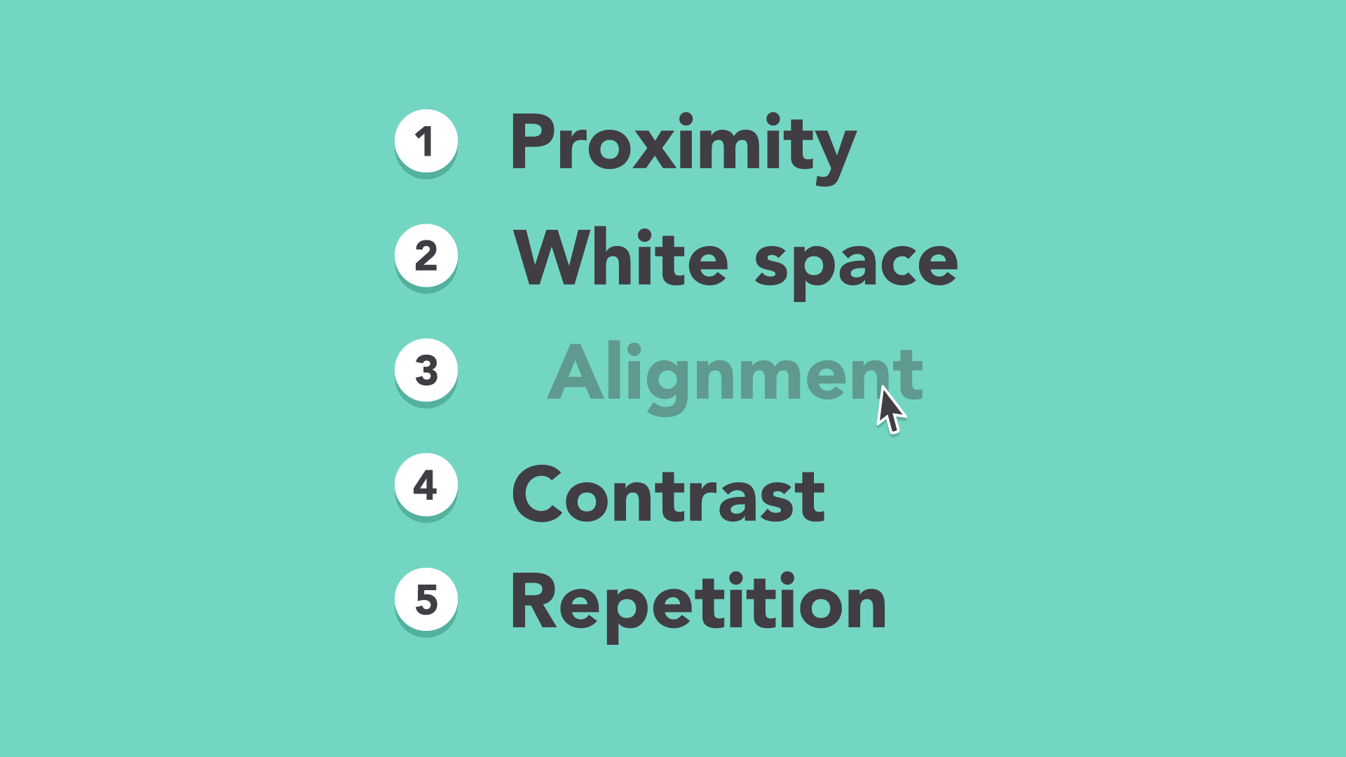
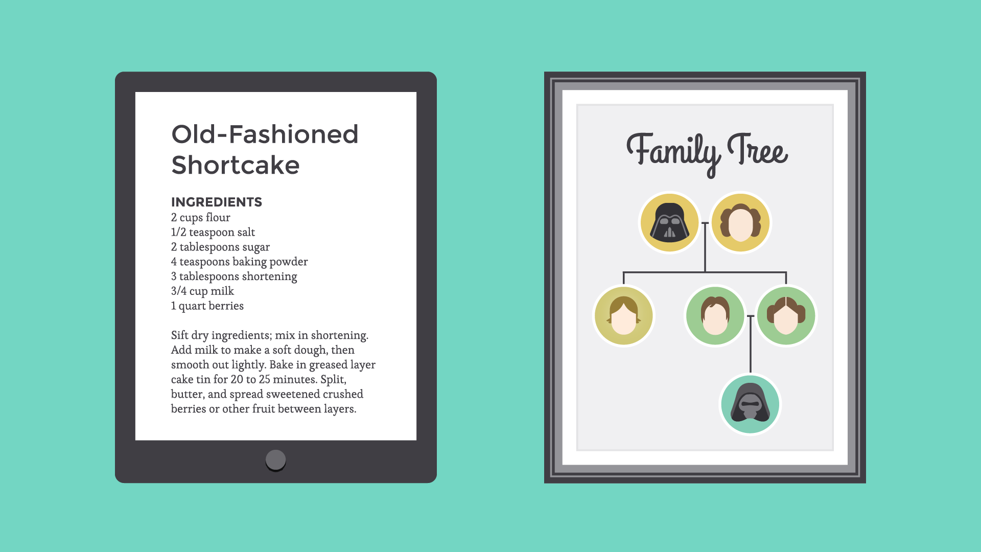
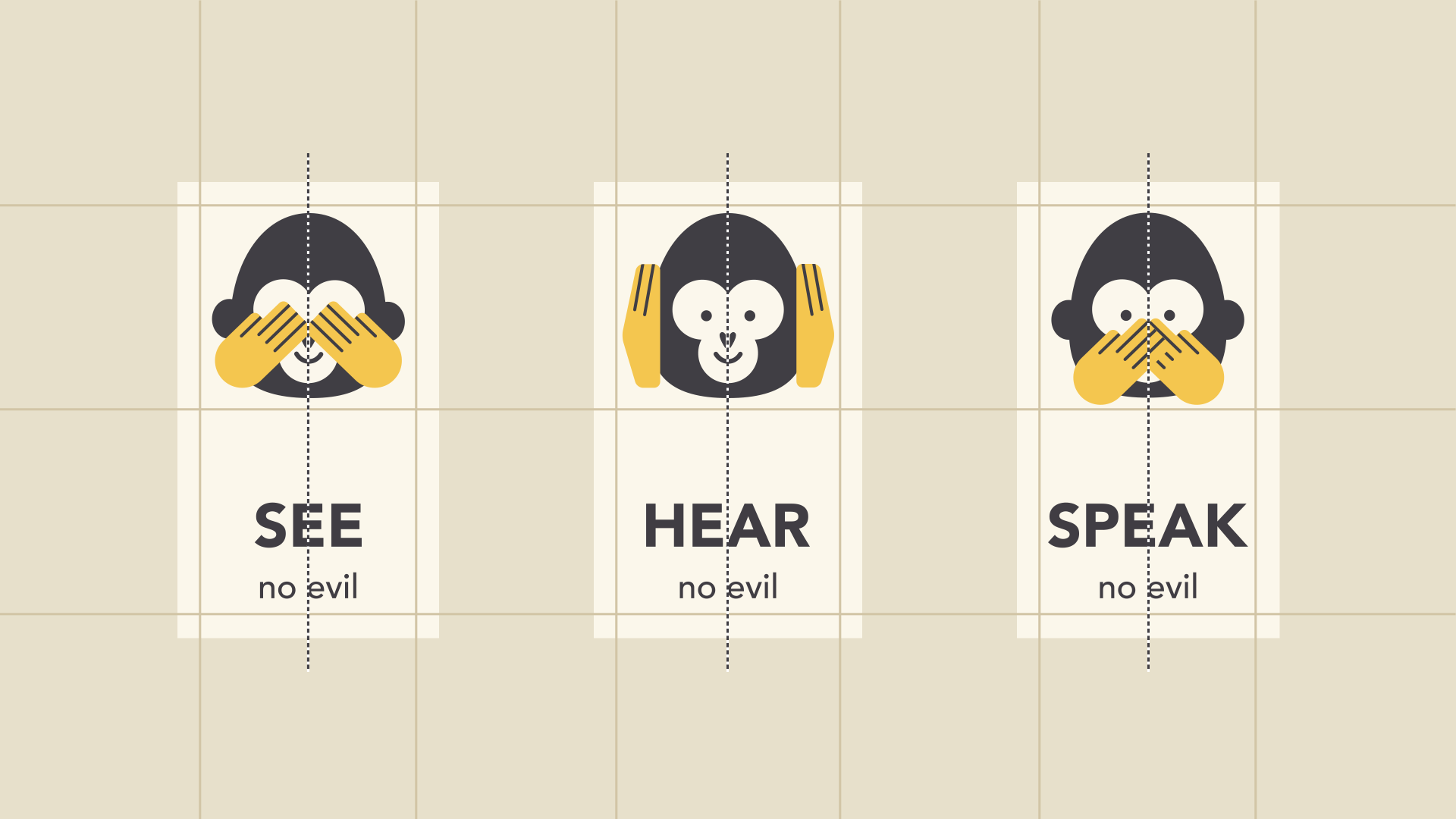
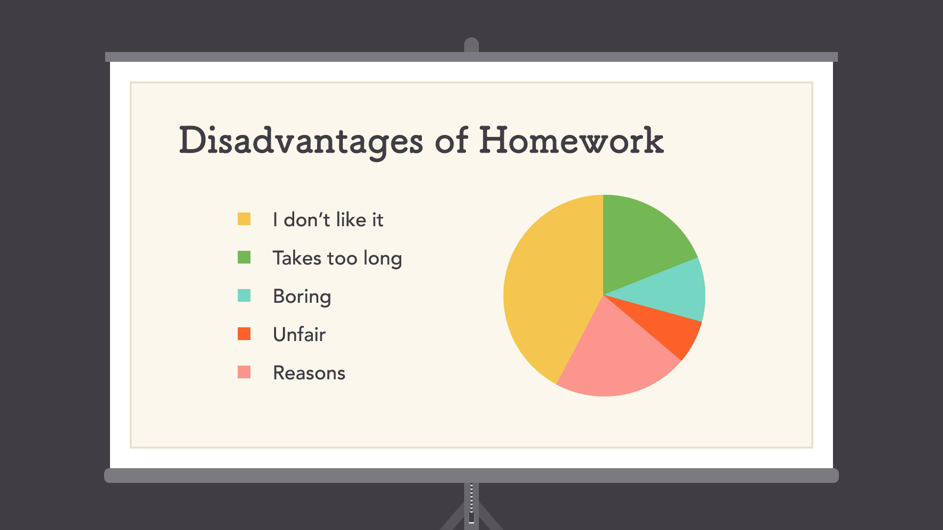
Proximity
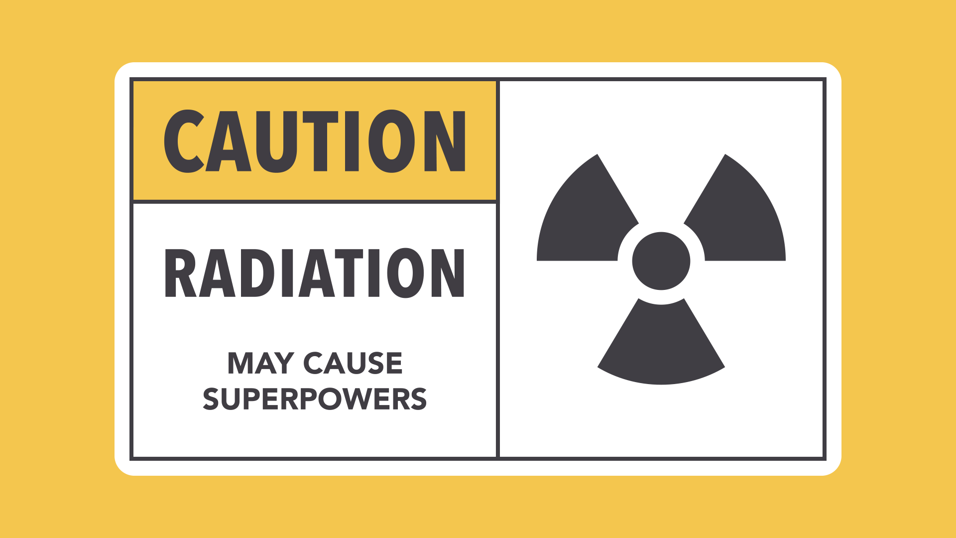
Proximity is all about using visual space to show relationships in your content. In practice, it's pretty simple—all you have to do is make sure related items are grouped together (for instance, blocks of text or elements in a graphic, as in the example below).
Groups that are NOT related to each other should be separated to visually emphasize their lack of a relationship. All in all, this makes your work easier to understand at a glance, whether it's purely text or something more visual.
White space
White space is an important part of every composition. Now, this doesn't mean literal white space; it just means negative space, like the spaces between your content, between lines, and even the outer margins.
There's no one way to use white space correctly, but it's good to understand its purpose. White space helps you define and separate different sections; it gives your content room to breathe. If your work ever starts to feel cluttered or uncomfortable, a little white space might be just what the doctor ordered.
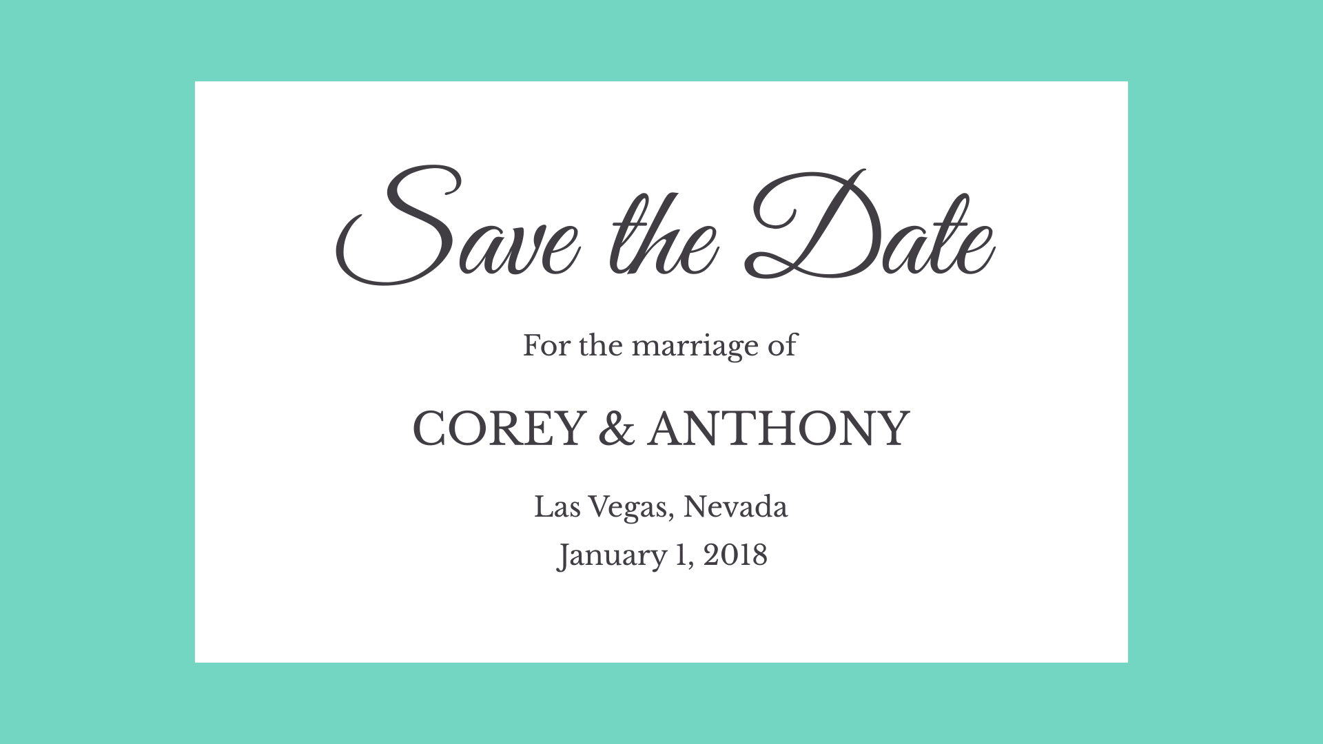
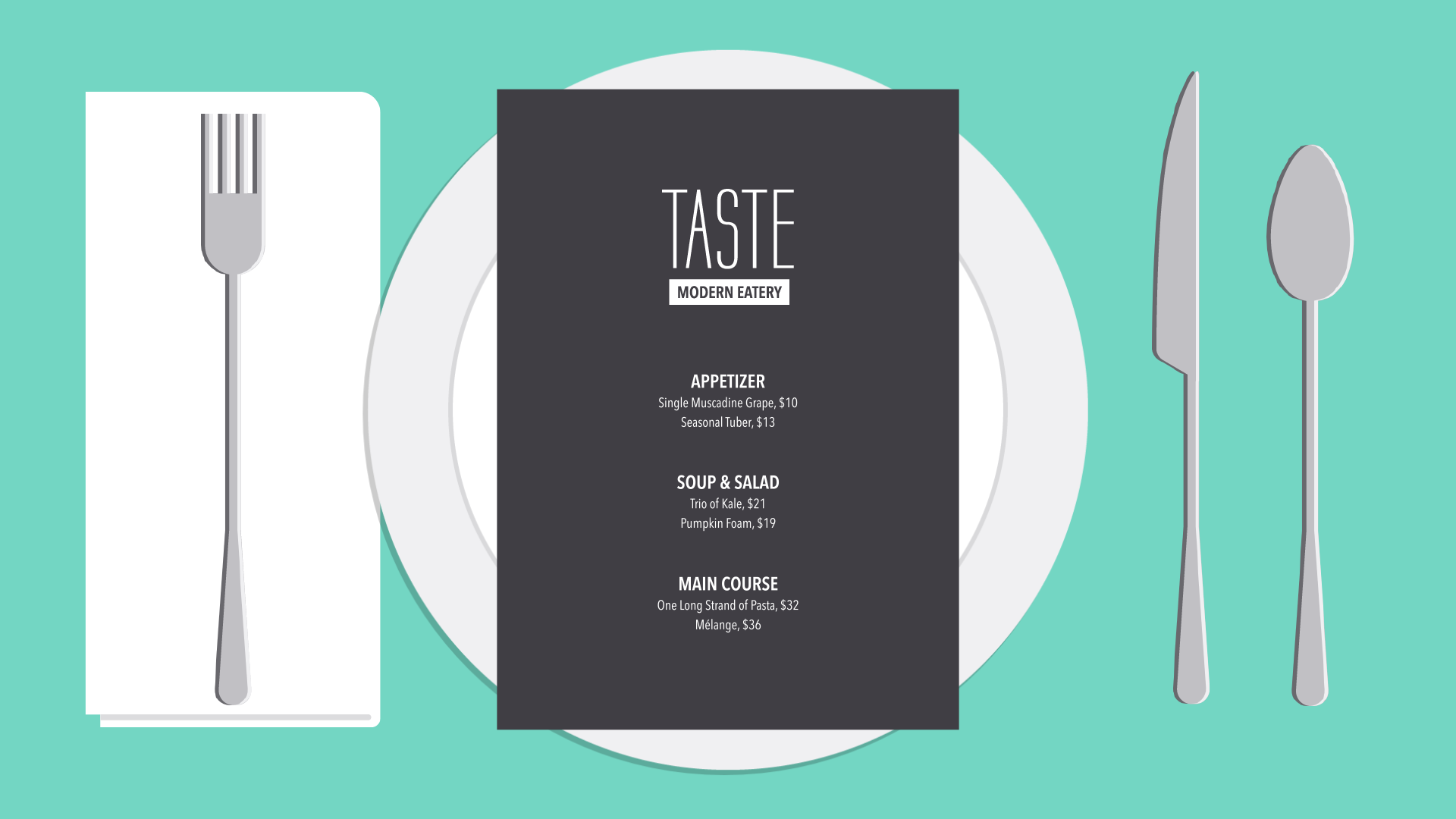
Alignment
Alignment is something you deal with all the time, even if you don't realize it. Whenever you type an email or create a document, the text is aligned automatically.
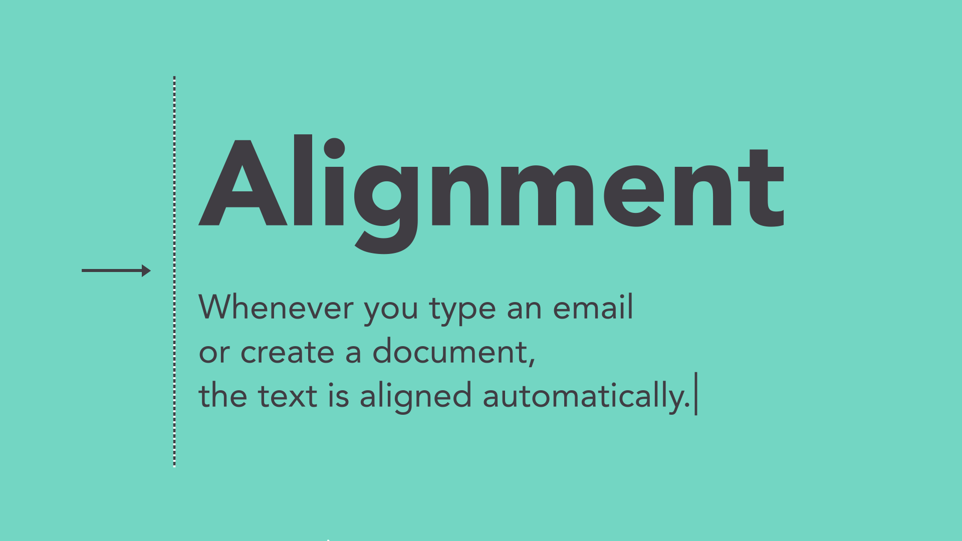
When aligning objects by yourself (for instance, images or separate text boxes), getting it right can be tricky. The most important thing is to be consistent.
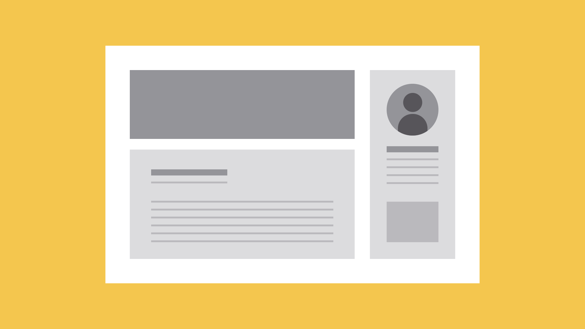
It might help to imagine your content arranged inside of a grid, just like the example below. Notice how there's an invisible line centering each image to the text? Each grouping is also evenly spaced and aligned, with equal-sized margins.
It's this attention to detail that makes the composition easier to navigate. Without consistent alignment, your work could start to feel disorganized.
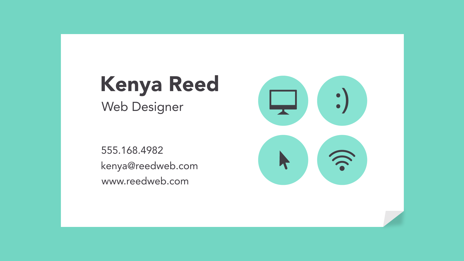
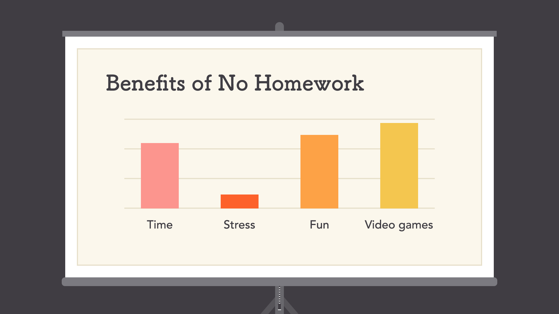
Contrast
Contrast simply means that one item is different from another. In layout and composition, contrast can help you do many things, like catch the reader's eye, create emphasis, or call attention to something important.
To create contrast in the example below, we've used color, more than one style of text, and objects of differing sizes. This makes the design more dynamic and, therefore, more effective at communicating its message.
Hierarchy
Contrast is also closely tied to hierarchy, which is a visual technique that can help the viewer navigate your work. In other words, it shows them where to begin and where to go next using different levels of emphasis.
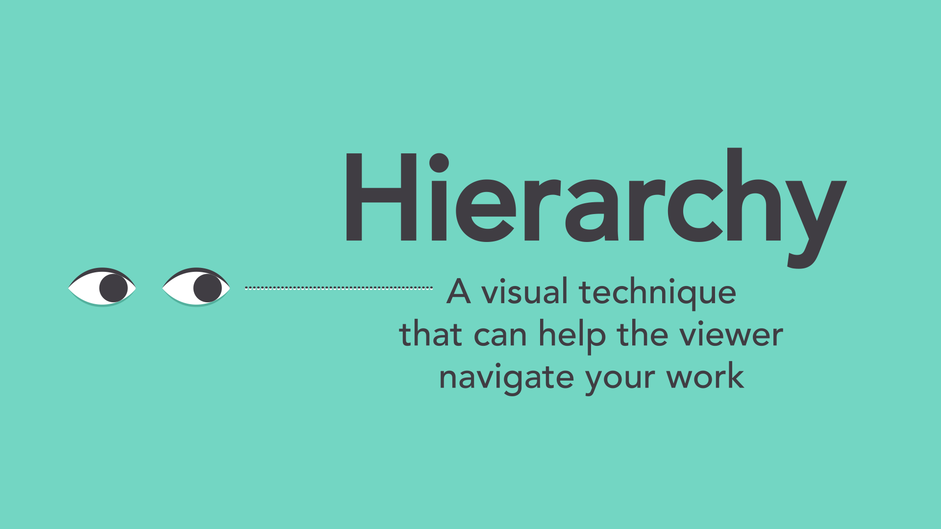
Establishing hierarchy is simple: Just decide which elements you want the reader to notice first, then make them stand out. High-level or important items are usually larger, bolder, or more eye-catching in some way.
Repetition
Repetition is a reminder that every project should have a consistent look and feel. This means finding ways to reinforce your design by repeating or echoing certain elements.
For instance, if you have a specific color palette, look for ways to carry it through. If you've chosen a special header style, use it every time.
It's not just for aesthetic reasons—being consistent can also make your work easier to read. When viewers know what to expect, they can relax and focus on the content.
Putting it all together
You might say layout and composition are the unsung heroes of design. It's easy to overlook their role, but they're part of everything you do.
The principles you just learned can help you elevate any project. All it takes is a little attention to detail and you can create beautiful, professional-looking compositions.
Nguồn: https://edu.gcfglobal.org/en/beginning-graphic-design/layout-and-composition/1/
https://www.masterclass.com/articles/layout-design-guide#7-tips-for-creating-a-layout-design
https://www.socialectric.com/post/layout-design-getting-to-know-its-principles-why-is-it-so-important-to-visual-designs
